I know I’ve messaged Supernotes about this before, but let me reiterate the issue so all the context is there.
Currently, the only way you know if a card is focused so you can act on it (edit, delete, etc) is by the drop shadow that shows behind it. It’s clean, but way too subtle that it’s easy to miss and not see it. I think there were ideas about adding some type of stroke to the card, but that might be too distracting (understandable) as I think I was told by Tobias.
I thought of a way that might be a great solution to this problem and it doesn’t deal with color or line strokes which I think would make it better for people with color blindness and others with similar disabilities.
Whenever a card is focused, the cards above and below would animate spacing themselves further away from the focused card. It would have to be an obvious amount of spacing that if you only saw the spacing between the focused card and it’s surrounding cards, you wouldn’t think that was the normal spacing.
Can also dim the other cards just a tad bit to make the focused one stand out a tad bit more.
The only issue i can see so far arising is when scrolling through cards. Not sure if this would be a hit on performance or if it loses its ability to be clear.
Anyway, just wanted to add this hear in case it’s useful.
Thanks for your feedback, and for sharing these well thought out ideas – definitely very useful!
One of the reasons why we’ve not spent too much time on this is that we’ve been focusing on the mobile app development. Knowing which card is focused is mostly only useful on Desktop when you are just using your keyboard to navigate Supernotes (which is definitely the preferred method ). However it’s not very helpful on Mobile when you can only view one or two cards at a time.
Adding an animation might look a little strange in Broadsheet view, although we could experiment with scaling a card slightly so it appears to pop out of the interface. Also I do really like the dimming cards idea, as that helps you focus on editing one card – and don’t want to see the rest of the interface. We will see what we can do!
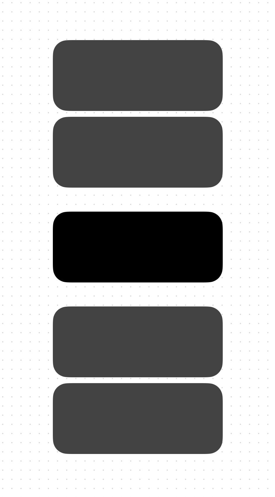
Also out of interest do you ever use Seamless Mode? If you plan on solely using using your keyboard, it is a lot more obvious, and clearly indicates which card is currently focused, as shown below:
I honestly hadn’t thought about using Seamless Mode. Thanks for the tip! I just love the look of cards and rounded corners haha.
I did think about Broadsheet and the idea I had was that the spacing would change slightly horizontally as well. Might look kind of cool, might not. I like your idea of the card kind of jumping out at you a little bit. That’s pretty good! If you’re testing anything out and want another opinion, throw a video my way or something.
A question about about Broadsheet view actually if you don’t mind, how do you navigate horizontally via the keyboard? I wasn’t able to find a way. I think the user is limited in that way because the right and left arrow keys are assigned to expanding and collapsing a card. However, I think a small change to those keys could be adding the option key as a modifier. So, in order to expand and collapse a card would be ⌥ + ← or ⌥ + →. It was jarring not being able to immediately navigate to horizontal cards.
I hope you guys don’t mind, but I have some feedback about the mobile app as well that I will be leaving.