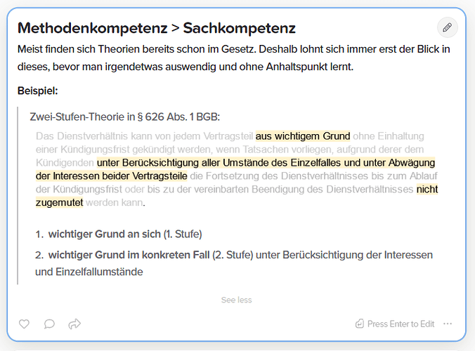
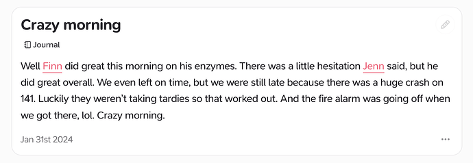
Maybe it’s only a personal problem but I kind of have trouble to differ between bold and normal text. In other apps the visibility of bold text is higher in my eyes.
I agree, the point of making something bold is to make it stand out from the other text, but too many times I find myself searching for the bold text and double checking in editor to make sure it’s actually bold.
Hi @isaiur, thanks for your feedback!
One of the difficulties is that different displays, display bold differently so some may make the bold appear just the right amount of bold while on some the difference might not be as noticeable. This also changes on dark themes. We will look into adjusting how the font is rendered.
For links maybe inline links could be rendered in blue and outgoing links could also render in blue but with the little arrow they have already? I think it’s a common way to display links …
I don’t know if there is a better way for displaying bold content. The readability depends on the background … in Obsidian I used to have a more bluegreyish background for the dark theme and it was easier with bold content. Maybe somebody else has a better idea or an inspiration from another app or so.
I agree with what has been said here. As far as links, in Arc I used their Boost feature to change the color of links to the Supernotes red color. They stand out far more. I still mainly use the desktop app, but I really like having internal links and external links stand out more.
That‘s a great idea! May I ask how you implemented the red color? Every time I tried to add text color I encountered a little color glitch I think. The hex code never rendered as on other pages …
Here’s the code from my boost for the links:
.markdown-body a {
  color: #ff6682 !important;
  border-bottom: 0.07em solid #ff6682 !important;
}
Thanks. But where did you set this up?
I used the Boost feature of the Arc browser. This should explain it: Arc | Boost Gallery
Got it! I’m on the waitlist for Arc Windows.

