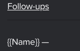
As things stand, <hr> tags (--- in markdown) rendered in black.
I assume this is a minor CSS oversight and that they should be bright (text-colored) in dark mode?
As things stand, <hr> tags (--- in markdown) rendered in black.
I assume this is a minor CSS oversight and that they should be bright (text-colored) in dark mode?
This is another super minor point, but as it stands it looks like <hr> tags have more space below than above them. Not sure if this is intended, but flagging it for your attention either way. 
Hi @tekacs, the <hr> tags were intentionally rendered black in dark mode so they match the card border – it looks a lot better. Here’s a full image for reference:
And good shout with the increased padding below the <hr> tags – it is probably a bit too much. We will improve it in the next patch.
That makes sense, thanks! On colour, the issue I’ve had is that the contrast between the card background and the <hr> tag is so low that I usually can’t actually see the separator at all.
Is there any way that that could be remedied in dark mode, at all?
Fair point! I will adjust the colours in the next update, so to be more legible.