wldh
1
Hi,
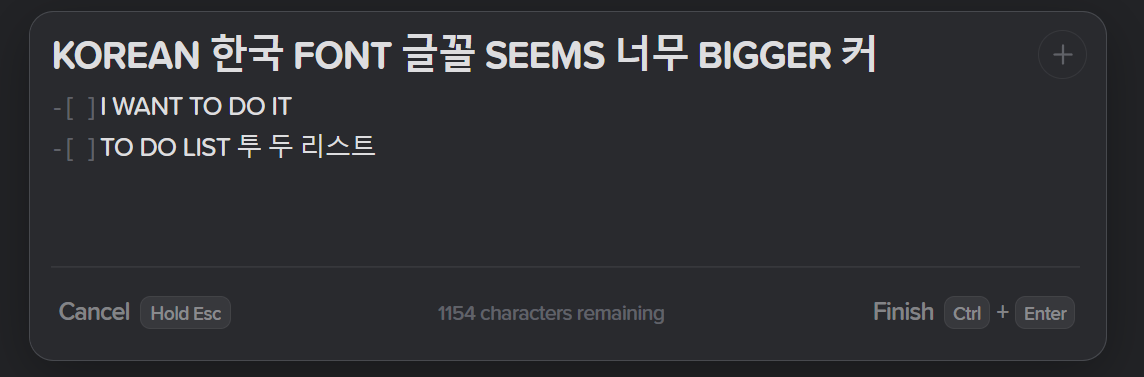
My native language is Korean so I make notes in Korean.
But the Korean font looks so big, especially in the note title. Below is an example.
I use Windows app, so the font may be Windows default one “맑은 고딕(Malgun Gothic)”.
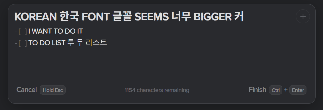
When I opened developer tools and manually set “Noto Sans KR” (by Google Fonts) as a fallback font, it looked better:
I don’t know you prefer to refer this kind of issue as a feature request, so the category is thoughts and feedback.
Have a nice day.
tobias
2
Thanks for sharing this @wldh!
We will see what we can do, so I’ve modified this to be a feature request for better support for Korean.
1 Like
wldh
3
hello, may I ask if there are any updates related to this? (font size consistency adjustment in multilingual settings)
tobias
4
Hi @wldh,
There’s a bunch of things we’ve scheduled to be done under multi-lingual support, including the above and:
This is quite a big task, and we have a few higher priority items at the moment, but we hope to have something out soon!
2 Likes
wldh
5
thank you for clarifying!
2 Likes