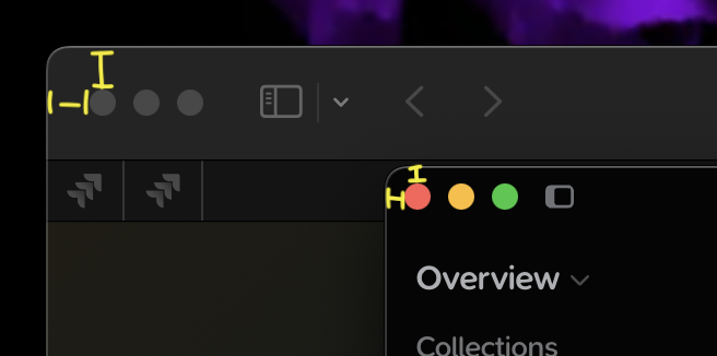
The window control buttons (close, minimize, maximize) in the Supernotes app are positioned too close to the top and left edges of the window. This is inconsistent with standard macOS design, where these buttons should have an inset margin from the window border. The lack of appropriate padding results in the controls appearing visually cramped and misaligned compared to native macOS applications.
Mac OS 15.6
Supernotes app
Steps to reproduce
1. Open the Supernotes app on macOS 15.6.
2. Observe the placement of the window control buttons (red, yellow, green) in the top-left corner of the application window.
3. Note that the buttons are nearly flush with the window’s top and left edges, lacking the standard macOS padding.
Hi @originalblez, welcome to the Supernotes Community
This is by design, so that the Mac traffic lights line up with our title bar at the top. Apple isn’t actually the best point of reference for standardisation as they vary this greatly between their applications – just open up the Calendar or TextEdit
Moving this into ‘Thoughts & Feedback’ as it’s not strictly a bug report since the functionality works as intended.
And thank you - since breaking slightly free from the Apple ecosystem (with a Nothing CMF2 Pro phone experiment) I’ve been looking for a secure, non-USA hosted and built notes app that works on Mac and Android. You were my the final choice in my longish search. It’s pretty good so far - I forked out for a year of subscription in advance which was a serious bet.
Aha not at all, it’s not about winning, Supernotes is informed by the community and we want to build the best product for you. We always listen and take everyone’s feedback on board – it’s a delicate balance between consumer expectations and innovating & creating new ways to interact with your knowledge. We appreciate your support Sean