Will there be an option on mobile to make the UI just a tad bigger? Looks gorgeous and the continuity between desktop to mobile is awesome. My only thought so far after using the mobile app is it just feels too small. Especially some of the buttons. They’re tiny. Wish they were just a bit bigger so you felt more sure when reaching for them.
Is this something you guys would consider? It just has to be one of the smallest looking and feeling UI’s on mobile out of all the apps I’ve tried. I’m sure you guys have done this for a reason to reduce having to do any big changes that would differ from the web or desktop experience. But if that’s the case, people aren’t using supernotes on the web or desktop. They are on their phones, so I would think there would be some adjustments to make it comfortable instead of just trying to make it feel exactly like the desktop. I’m all about familiarity, but not at the expense of easy reading and a comfortable ui.
Thanks for your feedback. This is something we are actively addressing at the moment. The most recent Supernotes 2.1 update made a lot of menus, buttons and interface elements larger, more tappable and swipeable. We haven’t got around to improving interactions on cards yet, but that will be addressed very soon.
Out of interest do you find it hard to tap those touch targets? Or just think visually they look too small?
Hmm, I still think the buttons and text in some areas may still be a bit too tiny. My eyesight is perfect, but I can see others having a real problem if it’s stressful on my eyes you know.
I think it’s both of those things you mentioned, where the tap targets are too small and visually they’re just too tiny. I wanted to show you an example from an app that I feel is polished from head to toe with amazing translation from all platforms (desktop tablet & mobile).
I’m sure you are familiar with Things 3 from Culture Code. When you go from supernotes to Things, you can easily notice the difference in space, touch targets, icon, text & button sizes.
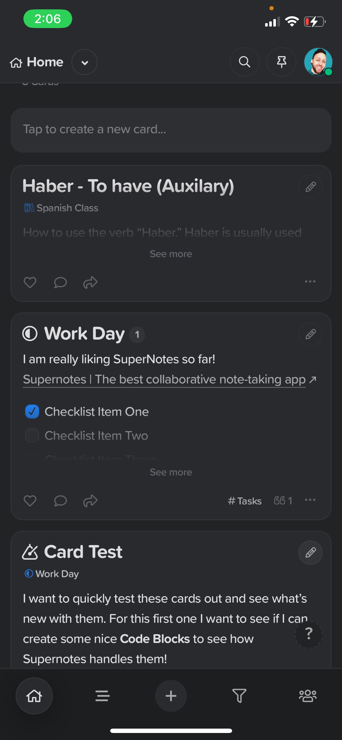
So here is supernotes:
Overall it looks nice and feels familiar. However, there is quite a lot happening in the UI where things feel like they are purposely made smaller just to cram it all in there. I personally don’t feel like this is a great approach because you give up a nicer and more comfortable user experience.
A quick example would be the 3 dot menu button for the cards themselves… they are so tiny it’s easy to tap the quote icon button on accident and even more commonly, any tags that exist on a card next to it.
When you jump into Things you can easily move around the app without feeling like you’re running into other buttons. It doesn’t feel overwhelming. I am aware that supernotes does a bit more for the type of app that it is. However, what Things does great is they don’t expose everything to you right up front. It’s there when you need it, such as the floating menu you bars at the bottom that expose more options when interacting with a task. The icons are a perfect size as well as tap targets. I don’t think anyone has a problem selecting things within the app.
Overall, I just wanted to share this example because I think Things really nailed the interface especially when we are talking about sizes of fonts, icons and touch targets, as well as great breathable space.
Thanks for the very thorough reply, especially going into depth and the comparison with Things 3 – very helpful!
What you’ve said makes a lot of sense, and we will definitely improve most if not all of these UI interactions in upcoming mobile updates. Looking forward to sharing these with you soon