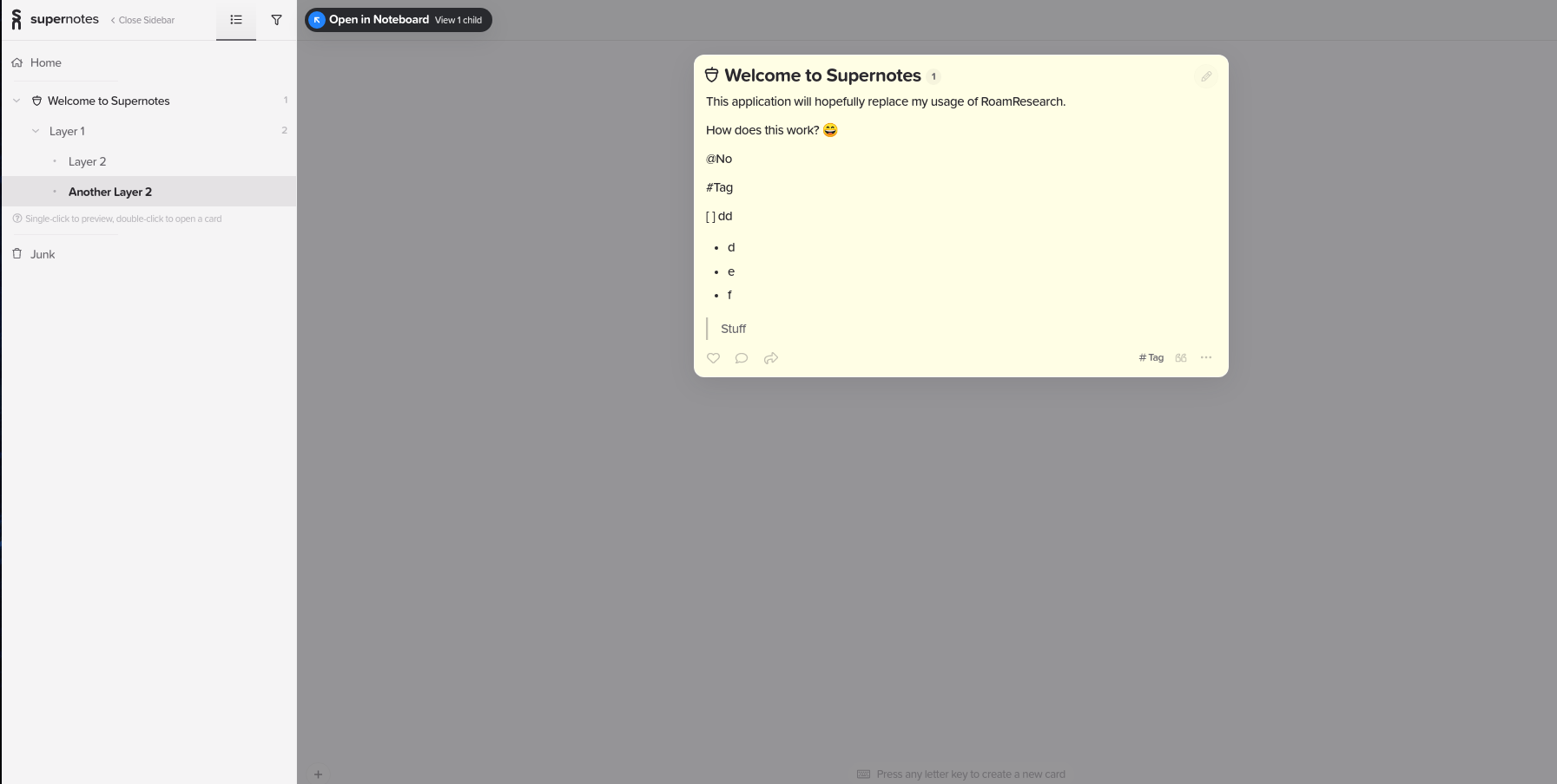
This image shows a card in preview mode, which blocks me from using it as a reference for my editing context.
There’'s a lot of clear space on my screen, though I realise this isn’t a given (laptops, etc); but a stacked view of preview cards, or use of a sidebar would allow me to pop open previews and continue to edit my active card.
Well… we actually had this behavior back before 1.1, when we added Preview Mode. Before Preview, users were getting confused by the whole tree vs currently opened card in the sidebar. In 1.1 we added card links and the preview mode, and wanted to make preview as clear and simple as possible so just nuked the card in the sidebar.
I still actually do think the use case of being able to see the parent card while you’re working on child cards is an important one, and we are trying to figure out the best way to allow this behavior. In the upcoming version of Supernotes we have reworked the sidebar UI significantly, so we will see how people respond to that and then potentially could add the “parent card in the sidebar” back to the mix.