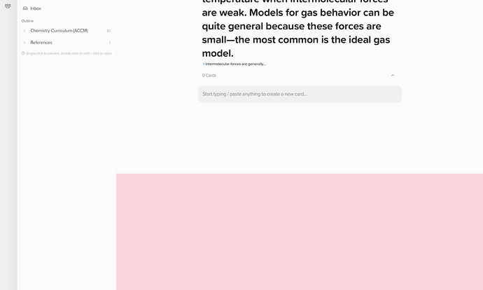
I am getting a pink shading in the web application that disappears when I create a new card:
Hi @Mark_Cubberley, thanks for the report. We’ve not seen this before.
Could you please let us know what web browser you are using? If you have another web browser installed does this same shading bug occur?
I’m using Safari (15.5). I was not able to reproduce this shading bug in Chrome when navigating amongst cards in my outline.
Thanks for the quick follow up, unfortunately I couldn’t replicate this on our end. Can you replicate this in a private window in Safari? Do you have any extensions installed in Safari, as this may cause issues with the interface.
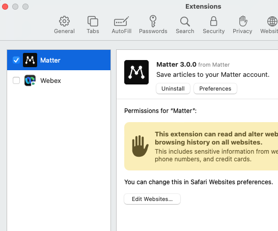
I was able to reproduce this bug(?) in a window and private window of Safari. I only have two extensions installed:

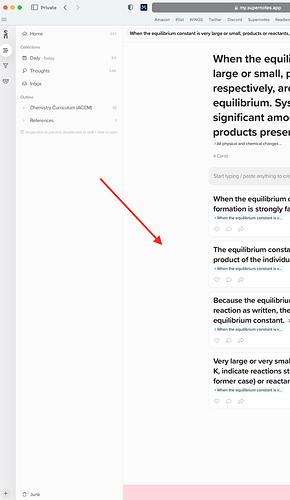
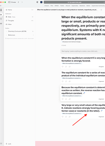
When I double left-click on blank canvas space or blank card space (see arrows), I get the pink shading:
Thanks for the follow up, you’ve found the reason! What’s happening is by double left-clicking, you are selecting the that HTML element below the Noteboard – which is a spacer. Just like when you double left-click on some text it will be highlighted pink.
It’s not bug per se, but I can see how this might be annoying, so we will amend this HTML element in a future update to prevent it from being selectable. (I’ve also edited the title of this topic to reflect the issue)


