There’s a few reasons why we opted for a our own novel “Broadsheet” view where cards are sorted down each column rather than organising them across columns; let’s call this left-to-right a “Masonry” view for now (even though these are usually interchangeable).
Creating a new card problem. Creating a new card when in Masonry view means always moving every card on screen; which is wholly disorientating, as well as requiring a lot of animations / performance. Currently with broadsheet view we’ve optimised it so cards move as little as possible since columns having varying lengths.
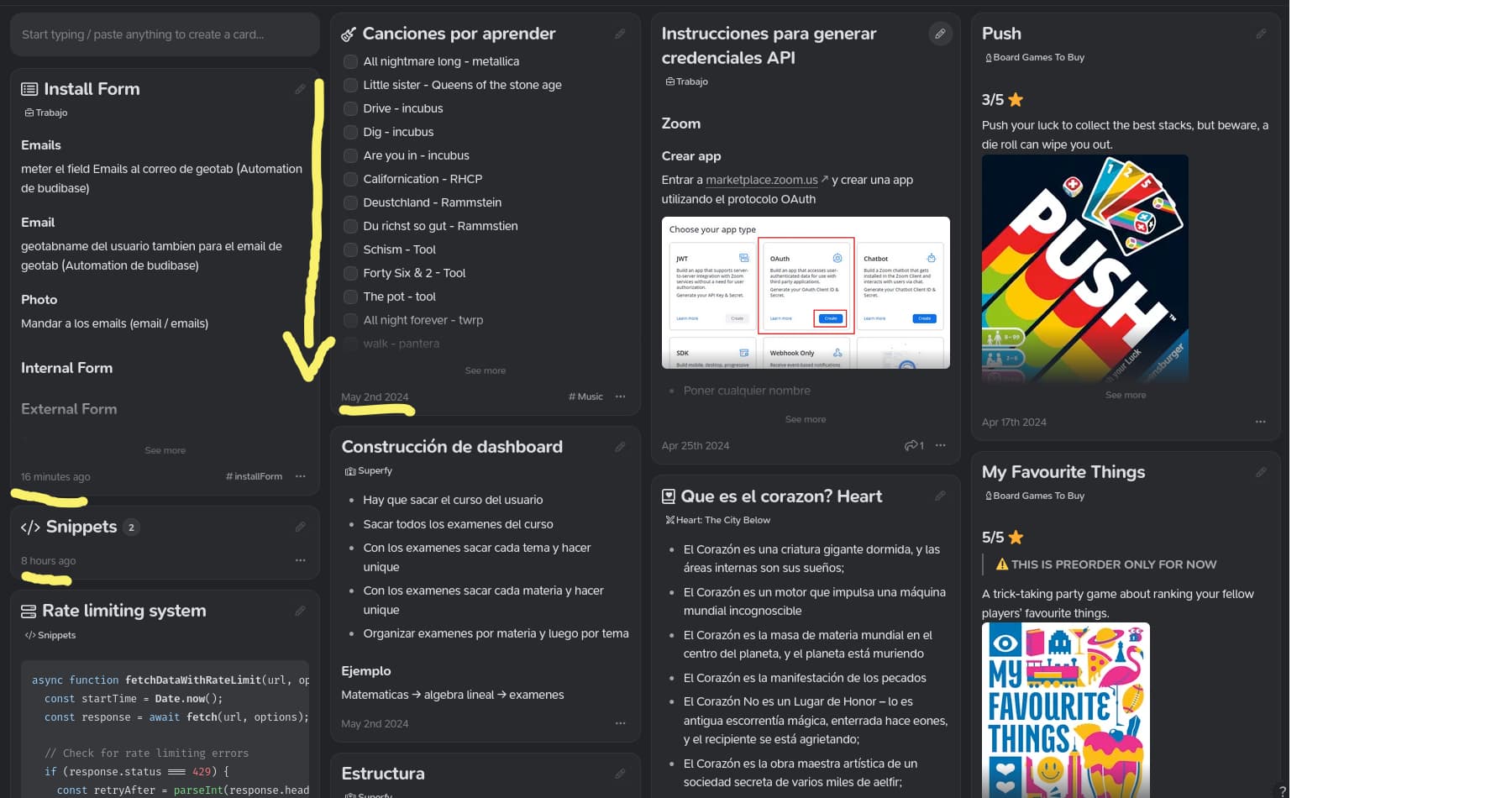
Varying card length problem. In your image you exhibit this issue as “Snippets” has no text. If you had multiple cards like this in one column in a “Masonry” this would mean the surrounding cards would likely not be in the correct sort order. The only way to prevent this really is either, with a clever algorithm that can bin multiple cards in one column if they are short (rather than just adding 1 per column) or by locking the heights of the cards so they are all uniform.
This are the main issues but in practice there were a few more. While it’s possible for us to add this, we’ve previously marked it out of scope internally. I will leave this under consideration for now. If anyone else would like this please like @geop0p3’s original post above. Or if you have any ideas let us know below
I think we can agree that left-to-right then top-to-bottom sort feels more natural, as you see cards that are close together in sort order in any scroll view position.
For creating/editing cards: Edit mode can fix column layout, so that the changing of the length only affects the column that card is on. Layout shift can happen on save instead. But your situation with height changes is definitely more complicated.
To avoid disorientation, layout shift should have no animation or a very snappy one
Is the performance bottleneck really that limiting here? I’ve seen e.g. pinterest or mymind use masonry with no performance problems. With a more complex positioning algorithm you might be able to have pre-calculated positions and lazy load/render cards on view.
Thanks for the thoughts @Chayut. Although you are correct then in the best case sorting left-to-right can feel more natural (ignoring Arabic/Japanese/etc speakers), the main issue is that with variably size cards it is not immediately clear which order they’re in horizontal mode, thus defeating the purpose entirely.
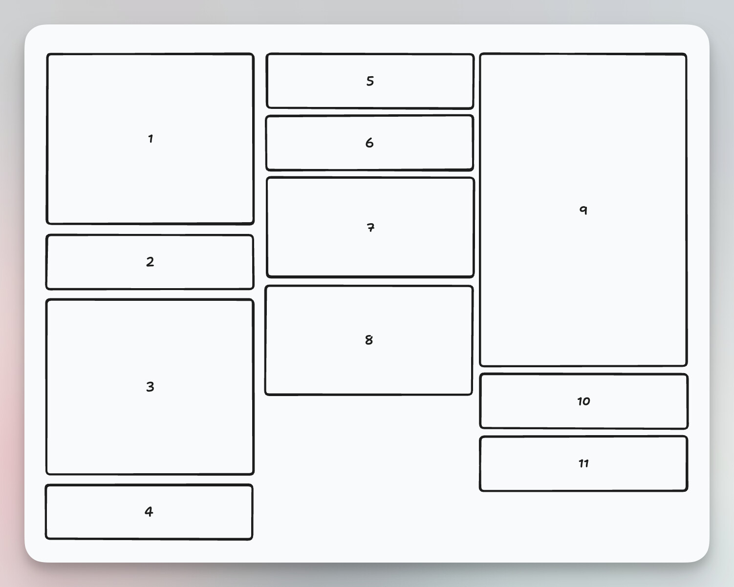
Here are two quick images to illustrate. This is the current system. Yes, it doesn’t take full advantage of screen space for people that care about what sort order the cards are in, but it is very clear what the order actually is.
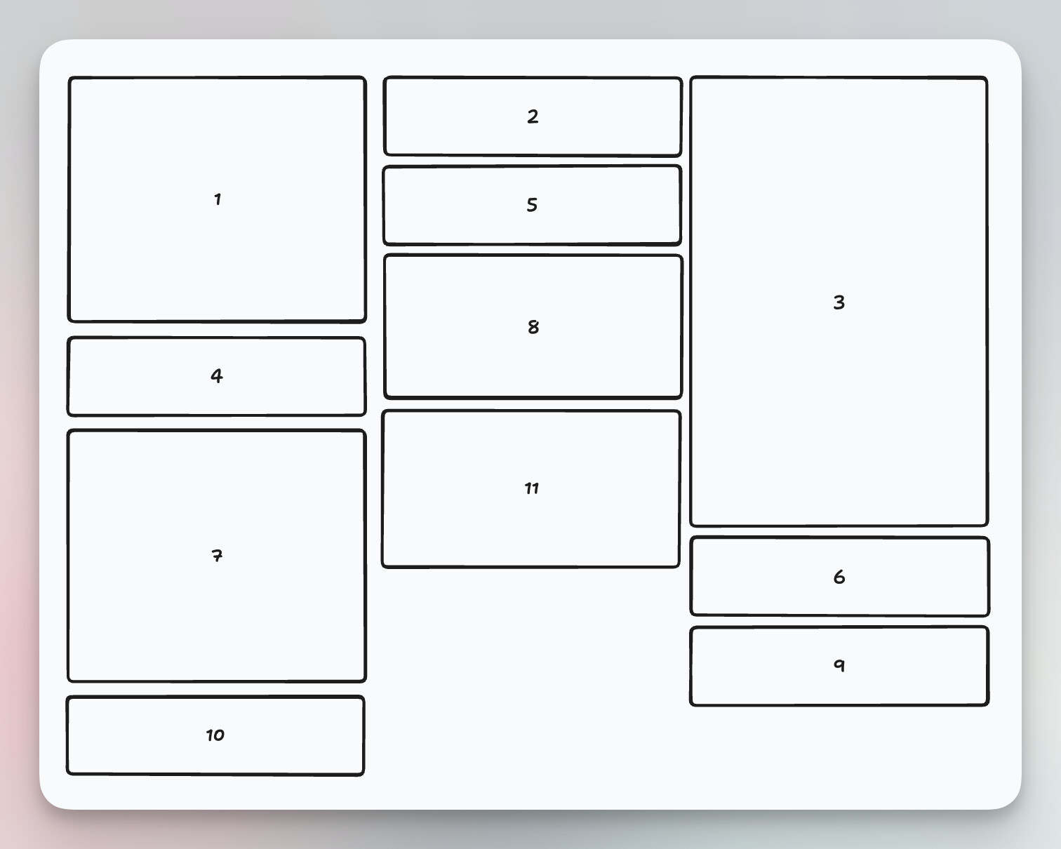
As you can see, although in theory the cards are viewable in a more natural order, what actually ends up happening (with variably-sized cards) is that the order just becomes very confusing very quickly, to the extent that your point (1) is actually incorrect, in that with this mode you can very easily end up in a situation where most cards are not actually adjacent to the ones which precede/follow them.
A view with multiple columns is always going to be a bad choice if you want to easily see the underlying sort order.
I understand the issues, and I agree there’s no easy fix. I love using the broadsheet view because it provides so much context when working with notes, especially on the home or today page. I think of it as analogous to a physical working surface laid out with paper notes.
I do hope some solutions can be reached that enhance the context around this interface.
@Chayut and @geop0p3 we added a new “Default Column Direction” with Horizontal Mode in App Preferences > Customise Behaviour with Supernotes 3.2.0. Let us know how you find it