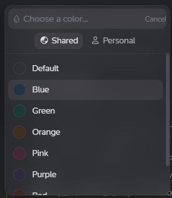
The terms ‘shared’ and ‘personal’ on the color selection interface are not intuitively understandable. It would be great to provide explanations for each term or to make improvements for better clarity.
Thanks!
Also, for some reason, the <cancel> button sticks to the right of the box.