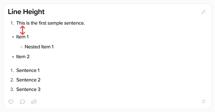
The line spacing between the Nested Lists and Bullets seems to be larger, is that intentional design or a bug?
Hi @hahahumble,
I’m not seeing anything out of the ordinary here. You’ve made three different types of lists (i.e. three different html blocks: one ordered list, one unordered list and one ordered list). And so they aren’t meant to be directly on top of each other, but have padding between them to show that they’re different.
Sorry, I have to finally come back to and revive this after thinking about several times. This might be intended and no bug but I want to re-open the discussion.
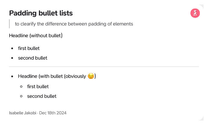
I use bullet lists very often and am having kind of a headline over the bulletpoints. For me between headline and first bullet is too much space. Several times I stumpled upon the first bullet and was confused because on my cards (aside from the atomic notes principle) the first bullet “comes out of nowhere” (to exaggerate it).
Would you mind rethinking it and maybe add a user preference for setting the padding?
Hi @isaiur, could you possible share a screenshot of this? Would be very helpful so we can pin down exactly what you’d like improving ![]()
I made a little test card to explain:
I would like to have the same padding on non bulleted headline and bullet point as with bulleted headline and bullet point.
For me it‘s very confusing when having a Blockquote for example which has a smaller padding to the headline as the headline to the first bullet.
Ah, the issue is that you’re not actually using headings, such as ### or <h3>, but just regular text which becomes a paragraph <p> element when converted to html. We intentionally add extra spacing after paragraphs before lists as otherwise the list looks too cramped at the top after a paragraph.
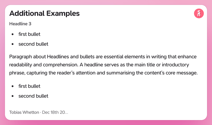
I’d suggest using a H3 for the headline before bullets, it looks cleaner and it does what it’s intended to do, be a headline.
Tried that out, thanks. It doesn‘t have to be a headline but it is definitely better looking.
Out of interest - how did you add this colored border? Isn‘t it a Screenshot via the copy-function when you right click on a card? It looks so much better then mine …
Good know, we’ll keep this in mind for future updates.
And that’s the Screenshot via copy menu, it’s just that this card is colored. We previously removed the background on non-colored cards, as per this feature request. However in hindsight, I feel like that should be a sub option not the default, we’ll look into changing it back to solid colors as the default, with transparency as an optional choice.


