Most of the time, the current range of colors fulfills all my artistic needs, but sometimes, just occasionally, I need gray and brown.
Have you ever had such an experience? ![]()
Most of the time, the current range of colors fulfills all my artistic needs, but sometimes, just occasionally, I need gray and brown.
Have you ever had such an experience? ![]()
+1 at least with gray. A lot of productive/PKM apps already realized that gray can be a good color to mean something is “done”, because it mixes the color of the letter with the background, meaning “don’t read it”.
And I can say that it’s kinda useful for my job.
Not for artistic reasons but… +1 with more colors.
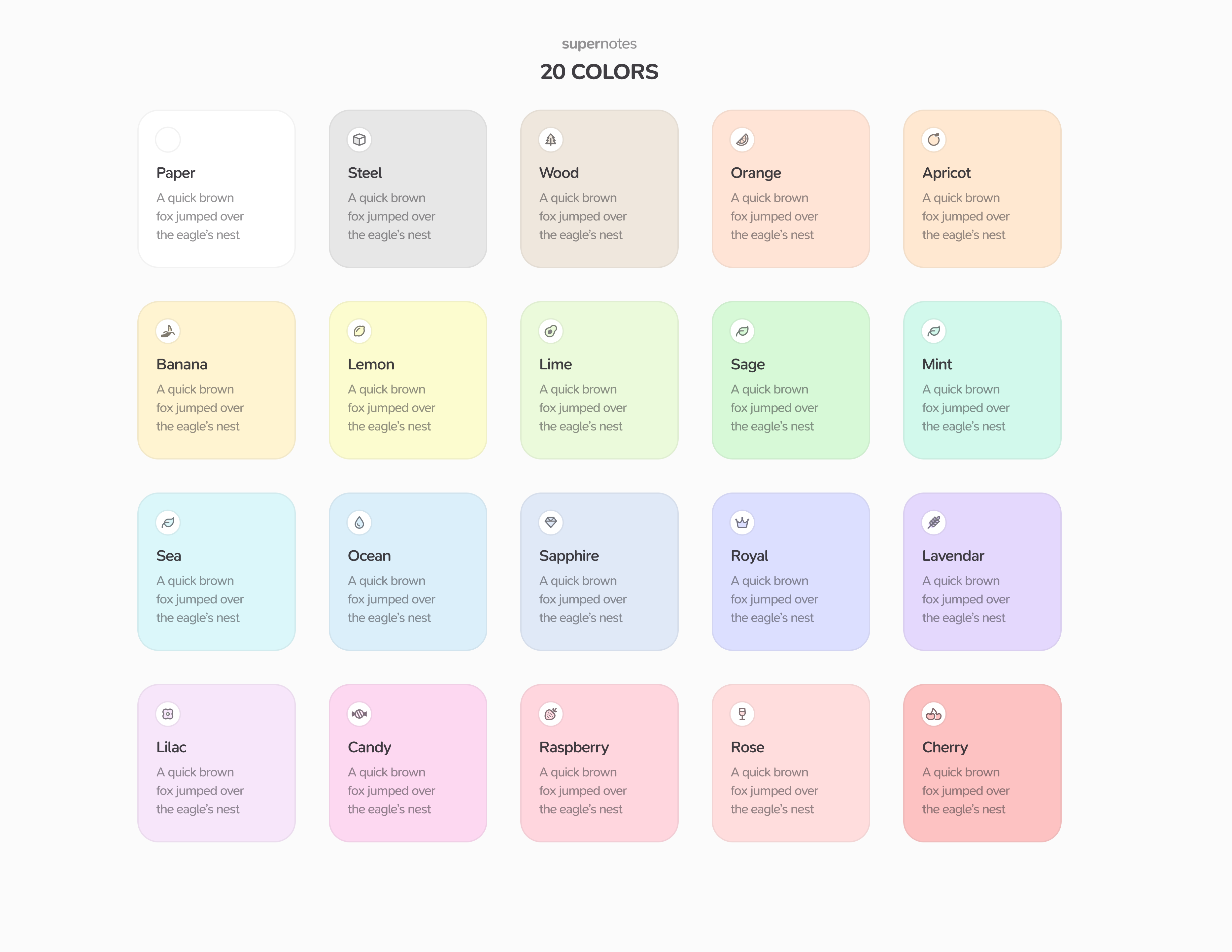
Previously, our stance was that we wanted colors to be visually distinct, so we always maintained a limited color palette. However moving forward, we are likely to introduce a wider color palette. This change will also include a symbol on the card to identify its color, improving distinction between day / night themes and providing improved accessibility for color blindness. Here’s a sneak peek:
Please note that all color names/values are subject to change, so don’t worry if you think that some colors look better than others – a lot of balancing is still needed!
I’m modifying this topic to be a feature request so we can keep track of this all in one place.
It looks amazing! Especially, introducing symbols by color to enhance accessibility is really, really cool.
Tobias,
Is there any thoughts on letting us use our own colors for the cards, ie hex or rgba?
Hi @docfips,
It’s something we’ve thought about, we’ve played around allowing you to assign a hue with the OKLCH color system to make this even simpler and for better theme support. But even then that’s why we’ve not added the wider color palette yet – making all the colors appear distinct between themes is challenging and why we’ve been playing around with pairing symbols with colors to enhance accessibility. We’ll see what we can do, but as always we’ll try to err on the side of simplicity and speed.
Just started with your app and I think it’s excellent. One thing I miss is the colours: I’d like to be able to set the dark theme and have notes in really bright colours. The idea being that the app background is there but not distracting, blending with the system dark theme, but the notes really stand out. At the moment when I choose the dark theme all the 7 available colours are really muted… unless I’m missing something here?
PS. I know this thread is quite old but maybe somebody else has similar preferences to mine?
Anyway, congrats for developing a nice app ![]()
Hi @latidude99,
Thanks for the feedback! Colors are tough, as it’s often a personal preference. Some people prefer the more muted look – others prefer the more bright look. We’ve considered modifying the colors a bit if you have the high contrast toggle on. I’ve added a +1 for this for you and we’ll see what we can do.
Just chiming in with a +1. Having a few more color options would be great as I’d like to color-code typed cards, and a wider palette of similar shades could help capture some additional nuance within a class (e.g. book versus article, both having a super type of “reference”).