Firstly, a typical situation where problems arise is when users mistakenly believe that they are focused on the Supernotes app and try to start editing a card by pressing the Enter key, even though the focus is on elsewhere. In this case, users fail to enter the card editing mode, and their workflows are unexpectedly disrupted.
Not all electron-based apps support visual changes based on window focus. For example, Spotify and Discord do not have any visual changes based on window focus (in the case of Discord, to reduce unnecessary power consumption, animated images and videos stop when the window loses focus). Therefore, for people who primarily use only the keyboard to operate their computer, such apps can be occasionally inconvenient.
On the other hand, apps such as Slack, VS Code, and Notion do provide visual changes. These changes can be broadly divided into three categories. One is adjusting the transparency of foreground-colored components such as text/icons. The second is changing the color of the window’s top title bar. The third is adjusting shadows to give a depth effect. Below are examples of each.
Case 1) General Windows App (Notepad)
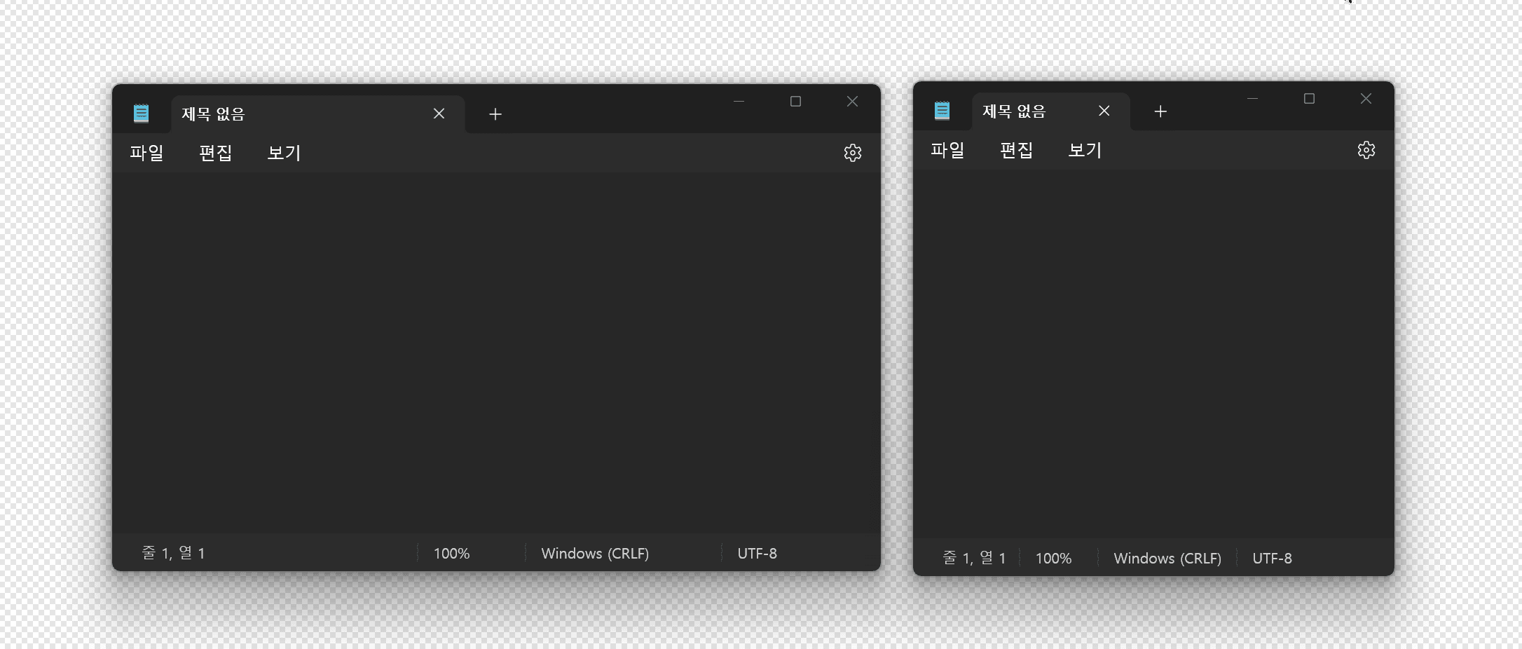
On Windows 11, Notepad displays all three effects mentioned above. The window control icons in the title bar turn white only when in focus, and the color of the title bar changes to a color associated with the background when in focus, according to Microsoft’s Fluent Design acrylic effect. Additionally, you can see that a shadow effect is added when the window receives focus.
Case 2) Electron-based App “Slack”
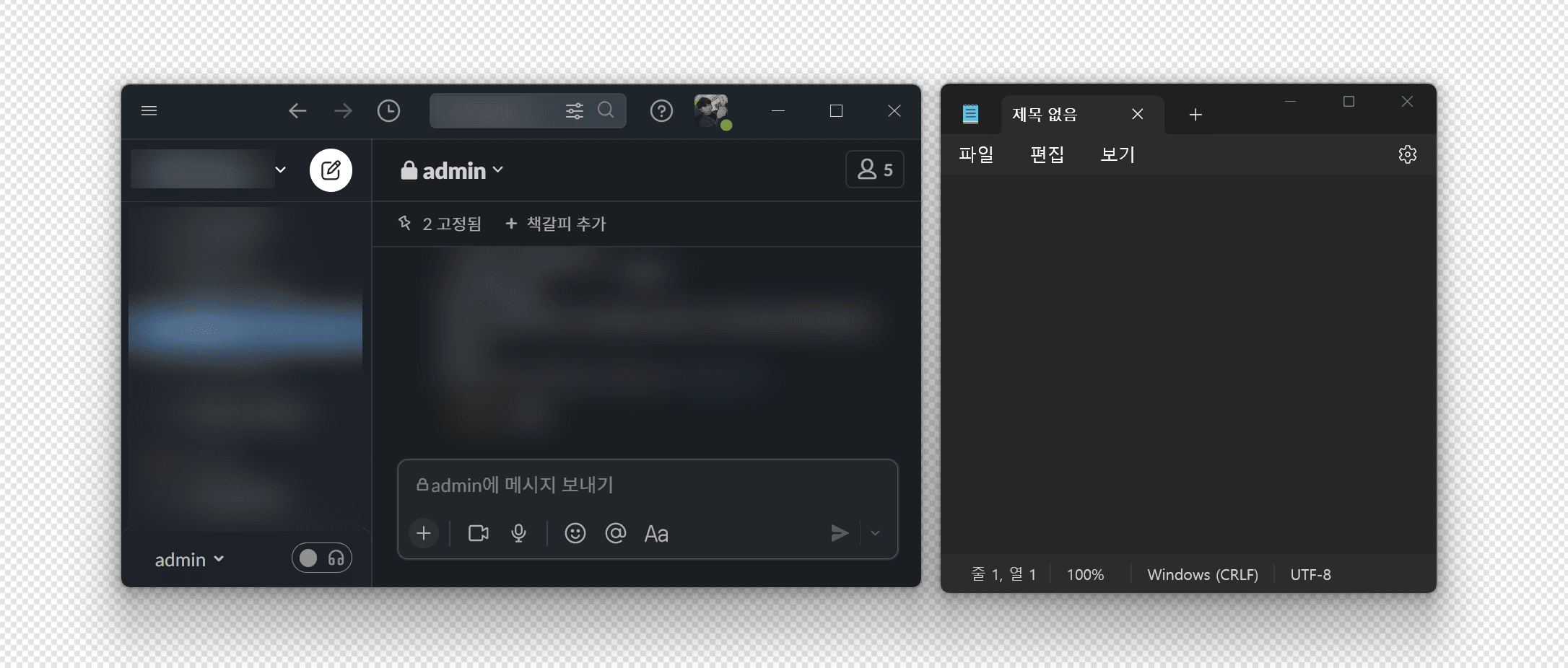
In the case of Slack, the color of the title bar and foreground color change (corresponding to the first and second items mentioned above). Please note that some parts have been blurred for privacy reasons.
Case 3) Electron-based App “Notion”
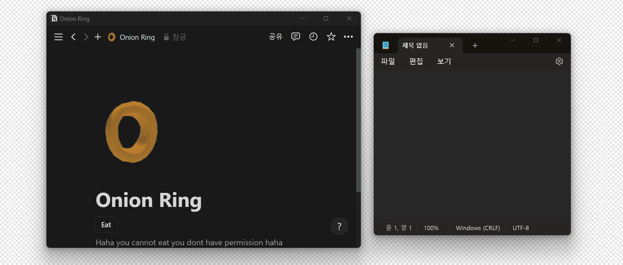
Notion applies the first (foreground color change) and third (window shadow) mentioned above. However, Notion is not an app that uses a custom title bar.
Case 4) Supernotes
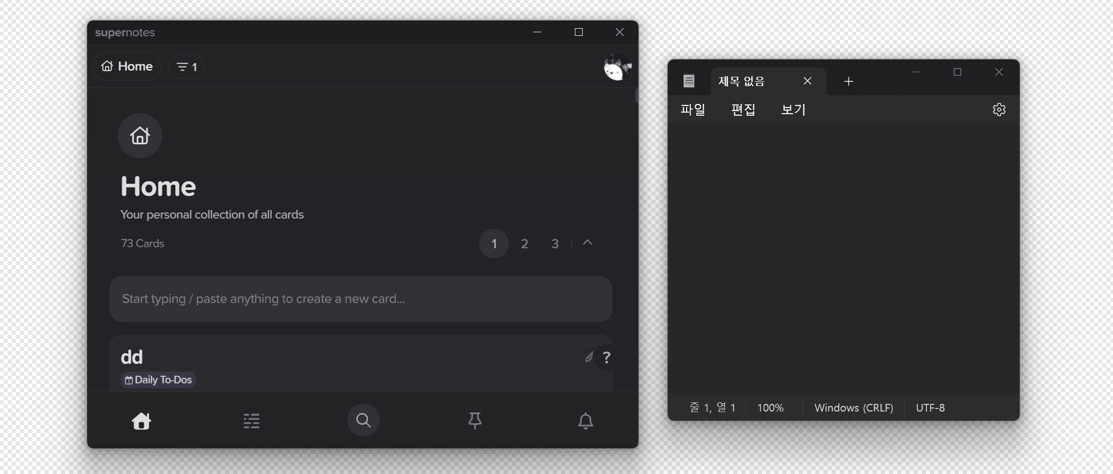
Supernotes currently does not have any visual changes based on window focus.
In the end, this feature request is not an essential item for app usage, but it will be helpful to users like me who use mainly keyboards and other users who have experienced the issues mentioned at the beginning. It will also improve the usability and completeness of the app, including accessibility improvements.