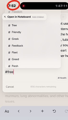
I want to show you this example, and ask if there is a way to choose from the tags menu as shown, I could not choose the tag “Free” or see it clearly.
Hi @upsaad,
We’re aware of this issue, but wanted to get out inline couplers asap. I was about to disable them on mobile in favour of the previous Tag Coupler with an input but decided against it to see how users found it. So there’s two solutions:
- Keep inline couplers on mobile but shorten the height to about 3-4 items. These means that generally you will be able to tap on them and they shouldn’t be cut off at all.
- Use the inline coupler keys to trigger the relevant Universal Coupler subsection, that has it’s own input box etc. (we will also fix that outstanding bug with adding multiple at the same time).
Which do you prefer? Or both?
I prefer the first solution, actually. Many thanks!
ah yes i noticed this too. and i too prefer the first solution since I’ve been really enjoying the inline couplers. will it also be slightly adjusted for iPad as well? I can still somewhat scroll up since it has a bigger screen so it’s not really an issue
Yep this will be improved across all devices @deadelia ![]()
This should of generally been improved since Supernotes 3.1.1, we went with the first solution I outlined above:
So I’m marking this as implemented for 2025 ![]()
