Inline code spans are hard to distinguish from surrounding regular text, because they are only distinct in their fixed width font choice. It would be a lot easier to recognize them while reading if the spans had a background color to them. I think this goes for both light and dark color schemes.
Hi @tinkerware,
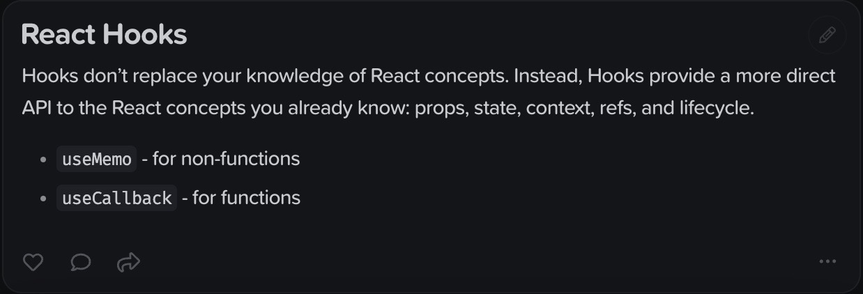
Thanks for your feature request. Which theme are you using? Could you possibly share a screenshot? Inline code spans already have a darker / lighter background to differentiate them from surrounding text, as in the examples below:


It’s possible your screen contrast settings might not be showing the distinction. We can looking into increasing the contrast in a future version to make them even more distinct?
Here’s how your example looks on my MacBook Pro with the Carbon theme:
I can see a very slight shade to it, but it’s not really noticeable on my screen or on my iPad unless I’m looking for it and paying attention. It doesn’t show up while I’m editing, where I also miss it, since I no longer notice the Markdown tags when they are muted.
Ah that makes sense, thanks for sharing. The Carbon theme was designed to be used in at nighttime, with no lights on – the difference should be noticeable then. Nevertheless you’re right there can be improvements to this, esp. also when editing. I’ve slightly modified the title and marked this as ‘In development’, hopefully we can include this in the upcoming major update.
1 Like
Carbon theme was designed to be used in at nighttime, with no lights on
Switching to Zinc helps a little, but light themes are a no-go for me; white/crème backgrounds in general are much too bright for my eyes and I have trouble looking at swathes of bright white screens for extended periods. Dark theme is more an accessibility issue for me and less an aesthetic choice (though I do like it better for aesthetics, as well).
1 Like
@tobias My all-time favourite monospace typeface is MonoLisa. I think it’s a work of art, and it never leaves my IDE or terminal:

I suspect that MonoLisa would pair beautifully with Proxima Soft (hint, hint!) ![]()
Have you ever tried it?
Hi @JamesT, MonoLisa is a wonderful font, thanks for sharing.
We’ve also considered JetBrains Mono. But are generally very happy with our current choice, FiraCode, due it’s extensive ligature support that MonoLisa can’t compete with (yet! ![]() )
)
@tobias Personally, I prefer FiraCode to JetBrains Mono, so I wouldn’t encourage that swap.
I agree that the ligature support in FiraCode is extremely impressive, and it’s a great looking typeface! I guess I just selfishly wanted all of my favourite tools to use my favourite font. But I understand your decision to stick with FiraCode.
1 Like