Thank you @connor and @tobias for 2.4! I love how supernotes receives new major features even at this stage of development. Yet, lightweight-ness and consistency are virtues that should not be lost sight of, so new features should be integrated rather carefully. Some thoughts:
I feel like the depth setting is different from the other settings in the top-left button such as sorting and view, as it controls the contents of the noteboard and not only the visualization of the contents. This makes me think whether this is the best spot to place it, or whether it may justify a dedicated menu with potentially higher visibility.
The novel modify currently active card command is a nice and quick path to alter a specific card’s properties. However, for me it feels unnatural that it refers to the opened car unlike every other command in the command prompt that either refers to navigation (such as go to junk), noteboard property (such as sort cards) or to the card opened in the noteboard (such as add note here). The fact that the command even shows when no card is opened and, in this case, uses the previously opened card adds to my confusion. I would argue that the added value of this feature does not compensate for the de-streamlining of the user experience, particularly so due to the fact that the feature is redundant.
As these thoughts are merely subjective, I’m curious what other users think of this. Any thoughts?
Thanks for your kind words, and yes as you’ve mentioned speed, simplicity and lightweight-ness is something we are keeping very front of mind. In response to your thoughts:
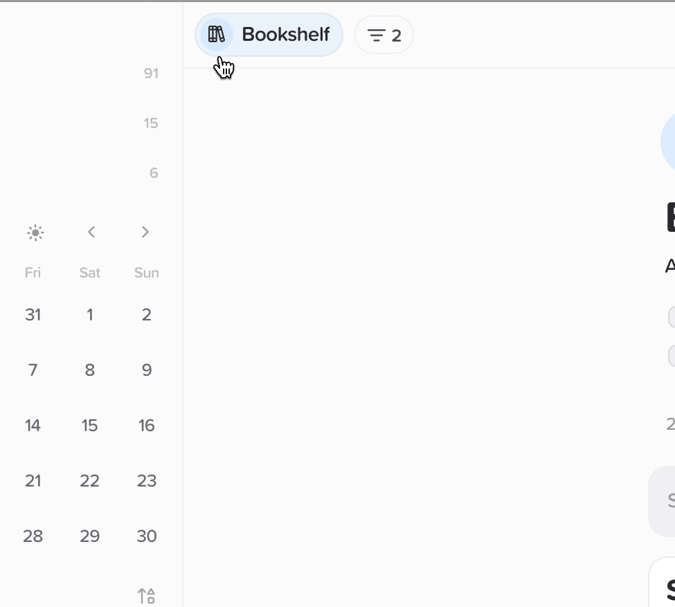
View Depth Improvements
Some good points. In actual fact the top three options in the menu when you have a parent card open are not to do with visualisation but are special options to do with that card. You will notice these options are not available with the Home and other collection views. So we feel it seems like the best place for view depth controls right now. It’s also nice to change view (to graph view for example) and be able to change depth within the same menu.
We are also thinking of adding a view depth indicator to the Active View name (see gif above), so you can quickly see how deep you are; by default at one level deep nothing is displayed. We’ve also added a keyboard shortcut (Ctrl / Cmd + D) to allow you to cycle through the view depths quickly (that’s how I’m changing it in the gif).
Modify Currently Active Card
We thought this would be a fun way to quickly give you the power of multi select without needing the full-blown interface. Often you just want to add a color to a single card for example, without needing to go into edit mode. By clicking on the card you focus it, and then by pressing CMD + K you can change the color using this new command. I’m interested if you end up finding this useful after a little while or if it’s still distracting.
If anyone has any further thoughts, please let us know below
I like how you address visibility of depth, something which I touched just a bit, but which may be my actual underlying concern - experimenting with that seems very promising, for me.
Regarding the second point, you may be right that it just takes some time to get used to this.
I have a quibble with the modify selected cards. Once a previously selected card is put off view (by eg adding it to a different parent, it still is selected. If I activate multi edit again, the previously selected card that’s now off view retains the selection and can’t be unselected by alternating the select all deselect all button on multi edit. Very confusing.