Raycast-like search experience in app

Hello everyone,

I want to bring this up again, as I still see it as a pain point right now:

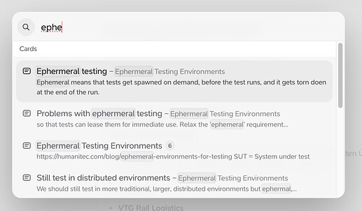
As a user, I want to be able to preview the whole note card while searching to be sure I select the correct one.

If you don’t want to give us a full-view search experience (which you have said before is due to consistency problems on mobile), I would even be happy with something more Raycast-like, where I can click through the cards and get a preview of their content.


2 Likes

Hey @Yannic, thank you for continuing to spearhead the effort to make our search better!

So I think we may’ve miscommunicated our stance on this previously, so just to clarify: we don’t want the desktop experience to be worse just because a solution wouldn’t work on mobile, but rather we prefer to find those solutions that work on all platforms when possible and we always want to find and address the core issues rather than slapping bandaids onto symptoms.

For example, in this case I would say the issue isn’t really “search doesn’t show me the full card”, but rather “search isn’t surfacing the card I want first”. So our preference would be to continue to improve the search algorithm so that rather than having to view a preview of many different cards to find the one you want, we just give you the one you want as the first result as much as possible.

To my mind, if you are having to view many different previews of cards in search, we have failed in that regard. But obviously this is easier said than done – search is a very hard problem and even if you find a pareto optimal solution there are still going to be cases where the card you’re looking for is not going to be near the top of the search results, so we’re still open to the idea of enabling a more comprehensive card preview.

Before we discuss that more though, I’d like to dig into the example you provided a bit more. You’re searching for a card that has something to do with “ephemeral”. In this case, why do you feel like the existing preview of results was not sufficient and you need a complete card preview in order to find what you’re looking for? In other words: what information is missing from our existing preview that would’ve helped you find the card you were looking for faster?

2 Likes

Big plus 1 to this, I often find myself struggling with the same problem. To paint my issue, the first card in the search is rarely the card that i end up with, because I often use the most common and simple search token.

So, if I’m searching for sidekiq I probably have ~100 cards on it. I add sidekiq concurrency now I have maybe 20. But I can’t remember the next token so I end up trying a couple different ones. Now because I don’t know if the card I see is the right one from the one sentence preview in the search, I have to open it, then see it is not in fact what I need, close it and reopen the search re-typing the terms and trying to narrow my search to something else.

The preview in my experience helps avoid the opening step and now I can see through the 20 options as I try to narrow them with an extra token to 2-3. Then I can easily see if those 2-3 are not right from the preview, I delete the last token and try something else, all without having to jump places in the UI!

1 Like

Hey, that’s good to here and I’m happy you are taking that approach and don’t just implement random feature requests :slight_smile:

For example, in this case I would say the issue isn’t really “search doesn’t show me the full card”, but rather “search isn’t surfacing the card I want first”.

I’d still disagree here. The problem in my opinion is not that you are bad at surfacing exactly what I searched for, but rather that my search is bad because I’m not completely sure what information the card holds that I’m looking for.

For example I have like 10-15 cards outlining different ways to print in python with f-string magic etc.
When I want to access a specific card, I often don’t remember the exact content, so I’d rather search for a general concept “print python” and then look through the cards to quickly find the one that has the content I’m searching for.

This is especially bothersome when I want to add a link to a card. In the current implementation, I have no way to know for sure that the card I’m linking is actually the card that I want to link, as I’m not able to see the content of the card but only a tiny preview of what it might be. Only after I have linked it, I can click on it to check, and if it’s not the one I wanted to link, I can repeat that process.

I think the problem boils down to having lots of cards with similar but different content / titles. I don’t have a problem with the general search algorithm, I think it’s great.

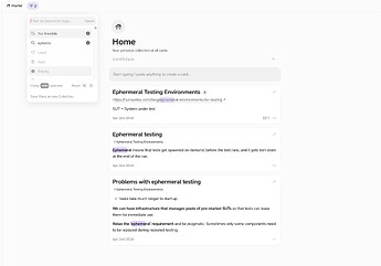
At the moment I rarely ever use the normal search button but go to the home feed and us the filter for serching cards like this:

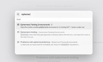
Rather then this:

Maybe to conclude: Search works fine for short cards, but for somehwaht longer cards it doesn’t work great. And card search in the universal couple is more often than not working at all for me, as you can see even less.
Giving a “card preview on hover” would solve all of my problems.

@Yannic your example appears to be showing search working flawlessly here. It’s surfacing all the relevant information that your filter did, but in less screen space. Perhaps I’m missing the point you’re trying to make?

Could I ask, what’s the exact question about ephemeral testing that you had in mind when you did this search, and in what way weren’t you presented enough information to answer that question?

1 Like

Sure:

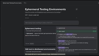
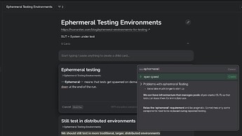
In my example, let’s say I was looking for this bit of information:

We can have infrastructure that manages pools of pre-started SUTs so that tests can lease them for immediate use.

I only remembered that I had written it down on a note about ephemeral testing, but not the exact content of how I had written down the information.

In a normal search, I am not able to see on which card about ephemeral testing I have written down this information. I would have to guess or add more context to the search, which I might not be able to do.

In the first (upper) image, I’m instantly able to see the content and know which card I was looking for because it doesn’t restrict parts of the card I am searching for.

I hope this makes my problem clearer. Again, I don’t have a problem with the search algorithm, it works wonderfully. But sometimes I’m not completely sure what I’m looking for when I start searching and seeing the card content helps with that.

information that your filter did, but in less screen space.

Also, I don’t think the goal is to make the search as small as possible. I have more than enough screen space on desktop, and I would love if the search made use of it. While searching I can’t interact with anything else in the background anyway.

1 Like

Thank you for the added details, super useful!

So would you say that the question you might be trying to answer would be something like: “I think that I captured a solution to the startup speed problem with ephemeral testing, but I can’t remember exactly what it was.”?

I think search is excellent at answering questions like that one, and in this case would lead you straight to your “Problems with ephemeral testing” card.

If you don’t have a specific question like that in mind, then browsing the content of your cards in the noteboard view (either by navigating to the appropriate parent card, or by filtering like you did) strikes me as an excellent way to use the features Supernotes offers.

You’re right, and I could have worded that better. What I meant was showing all the relevant information in a condensed format that optimises our ability to quickly find the relevant card.

I’d argue that if you need to read the entire content of a card to find the information you’re looking for, then you’re not searching, you’re browsing. Does that make sense?

@JamesT That feels like a semantic distinction to make :smile:

Is searching and browsing supposed to be mutually exclusive? Plenty of searching that I have used involves a preview. Sure, call it browsing, but it’s there to power up the search function, no one is “consuming” the content via the preview.

1 Like

You might be right. However, I do think there’s some value to be gained by thinking about the difference between the two. For example, Google doesn’t show the entire contents of each linked page in their search results. You could say that they draw a strong dividing line between search and browse use cases.

In my opinion, the best tools understand exactly the goal the user is trying to achieve and give them the sharpest features possible to achieve it.

I can definitely imagine adding more browsing features to search, or more search features to browsing. But tangling separate goals and features together is a dangerous game, where the end result can become muddled and blunt.

No. If I’m trying to find some specific card that holds a specific piece of information, I’m doing a search.
I honestly think the distinction you try to draw between search and browsing doesn’t make sense.
Currently I am ‘missusing’ the filtering function as a search bar, because the actual search doesn’t work for me in many cases. Like in the example I have outlined above.

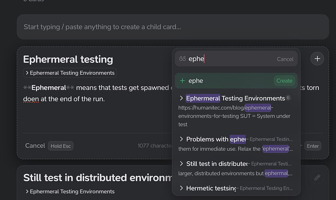
In general, the bigger problem for me here is, that the universal coupler doesn’t allow, what you call ‘browsing’ for a card. If I don’t know all my cards by hard and am not searching for the exact right terms, it’s a guessing game in the universal couple to link a card.
The “search” window here is even smaller than the normal search window, giving me even less context on the card I’m trying to link. Given that I only know that the content I’m trying to link is on a card about ephermeral testing, how would I find out which of the cards I’m looking for, in the example image below?
It does not provide me with enough information to select the right card to link (especially with somewhat longer cards)

But tangling separate goals and features together like is a dangerous game, where the end result can become muddled and blunt.

I agree, but I don’t think this is what I’m asking for. I don’t want to combine searching and filtering. I simply would like it if I was able to see the cards during search, like they have already implemented it themselves in the raycast extension.

Or soemthing like this, where the universal couple is a little bit bigger and then you can maybe use the right arrow key to preview the card, left arrow key to end the preview.


1 Like

I completely agree with you that we’ve landed in a semantic disagreement about the meaning of the words search, browse, and filter. I suggest that we try to define our terms (in the context of this discussion), so we can try to understand each other better.

Search: the act of attempting to locate a particular piece of information, usually using keywords related to the title or content of the target information
Browse: the act of reading content from multiple sources; to build understanding, remind yourself of previous knowledge, or find information when you can’t remember specific keywords related to it
Filter: the act of reducing the size of a list of multiple sources of information, usually to focus on a subset of relevant content for your current task

If you agree with these definitions, would you also agree that Google search doesn’t let you browse (or filter) all the content in its search result pages? If so, do you think that makes it a bad search?

I’d argue that you’re using filter exactly as it’s intended. You’re not sure which keywords to search for to find the card you’re looking for, so you’re filtering to narrow down the “search space” and reading multiple card’s content to achieve your goal.

TLDR: search is perfect when you know what you’re looking for. In that case, you probably don’t want to expose all the content of every card, because it’ll slow down the “quickly locate this thing I know” use case. Filter is perfect when you don’t know exactly what you’re looking for, as it exposes more content and lets you browse to locate the relevant information.

I can generally agree to your definitions (even though they are quite fuzzy ). But in my opinion, everything that I have described here in this post is search and not browsing or filtering.

you’re filtering to narrow down the “search space”

I think this is a good example on the fuzziness between the three things. They are not mutually exclusive.
“I’m filtering the search space” :smiley: At the end it’s kind of all search, just the visualisation of the search results is different.

TLDR: search is perfect when you know what you’re looking for. In that case, you probably don’t want to expose all the content of every card, because it’ll slow down the “quickly locate this thing I know” use case.

Really depends on the implementation, and Tobias and Connor always did a great job at implementing ideas :slight_smile: Even my idea in the last message does not take away from the current implementation, it only adds the option to preview the card during search, if you want to.

And as I have pointed out before (my bigger problem), filtering for cards does not work in the universal couple when I try to link a card.

1 Like

If you agree with these definitions, would you also agree that Google search doesn’t let you browse (or filter) all the content in its search result pages? If so, do you think that makes it a bad search?

Frankly, comparing to Google is not suitable in this context. For one, google results can be pages with massive amounts of content, so showing it would be impractical compared to what is a size capped card (most of the time nowhere near the max size)

In addition, content on Google is not something I wrote myself, so by definition, I need to “browse” within search results to see if the result contains what I need, and sometimes I don’t even know what the answer should look like. This is a very different experience. And to be fair, when I can get an answer from google from their previews or custom generated answer box, it is the best of both worlds.

I think @Yannic is surfacing a very real usability issue, within both the search , but also other search related functions like linking. I myself cannot agree more, it’s a big friction point for my flows.

1 Like

@fuzzy.beach You’re absolutely right that there are important differences between Google and Supernotes searches. The two main reasons I mentioned Google were 1) to strengthen my point about search, browse, and filter being different actions, and 2) to demonstrate that at least one other well designed (and universally understood) search feature takes a similar approach to Supernotes.

For the reasons that you mentioned, point 2) would have been much stronger if I’d picked a knowledge management tool instead.

So let’s pick Notion. Its search feature looks a lot like Supernotes, and perfectly matches my earlier definition of what search is, and how people use it. Obsidian’s search feature looks a little different (it’s in a side bar, rather than a modal panel) and I’d argue its results offer less context compared to Notion and Supernotes. But Obsidian’s idea of what search is, when people use it, and how it should achieve its goal is essentially perfectly aligned with my definition.

Instead of me doing this same exercise with every knowledge tool that I’m familiar with, let me flip the question around to you and @Yannic. Which knowledge tool uses an approach to search that’s closest to what you’re asking for? If I can see it and try it, then there’s a strong chance that I’ll understand why you think it’s better.

Let’s look at Notion Mobile & Desktop:

Mobile
If I search in Notion mobile, I get a full page of search results.
If I search in Supernotes, I get a small popup with search results.

When I click on a search result in notion, A full Note opens. BUT, I can simply swipe back to get back to the search results (like on Google too). So I can “preview” the search results, but easily continue the search if it was the wrong card.

On supernotes, when I click on a search result, the notecard opens. And if that notecard was not the one I intended to open, I can’t go back to the search results page, but need to start a new search, including typing in the search term.

In that regard, notion mobile search is fundamentally exactly what I’m asking for. Do a search, Open a notecard and then be able to easily go back to my search results.

Desktop
On desktop notion also only gives a popup like supernotes, but it is

  1. Way bigger
  2. Gives way more details, and even has a short preview on the right including the start of the document
  3. When I click on a search result, the search is saved. If I click search again, after clicking on the search result, the search result page just opens again
    → That allows me to quickly scout a search result and get back to the search results page

Supernotes behaves the same as on mobile.

As you can see, Supernotes search has a fundamental difference to Notion search: Not being able to get back to the search results page, after opening a notecard from it.

to demonstrate that at least one other well designed (and universally understood) search feature takes a similar approach to Supernotes.

And also google (or the browsers) allows to get back to the search results page easily with one click if the first search result you selected is not the correct one you were looking for.

So booth Notion and Google Search are actually good examples of what I’m asking for.

Which knowledge tool uses an approach to search that’s closest to what you’re asking for?

Apple Notes actually does this, and contrary to what you say, obsidian does this too:

  1. You do a search
  2. A search page opens, that has the short note titles on the left in a sidebar and I can click through them and see the whole card on the right so I can see the whole card that I have selected from search without closing the search.

Both solve the problem of quickly scouting through multiple search results.
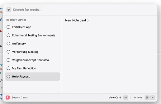
2 Likes

Thank you for this clear explanation. Now I understand exactly what you’re asking for, and I agree that maintaining the previous search is extremely useful. :heart:

1 Like