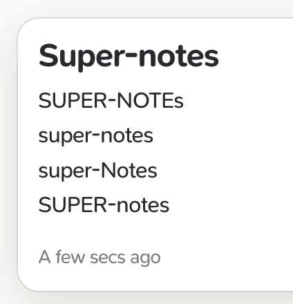
I really, really love the new font. My only nit-pick is that the hyphen character looks oddly high when you use it between two lower-case words.
Does anybody feel the same?
I really, really love the new font. My only nit-pick is that the hyphen character looks oddly high when you use it between two lower-case words.
Does anybody feel the same?
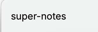
for comparison from a different fonttype
Hey @Yannic,
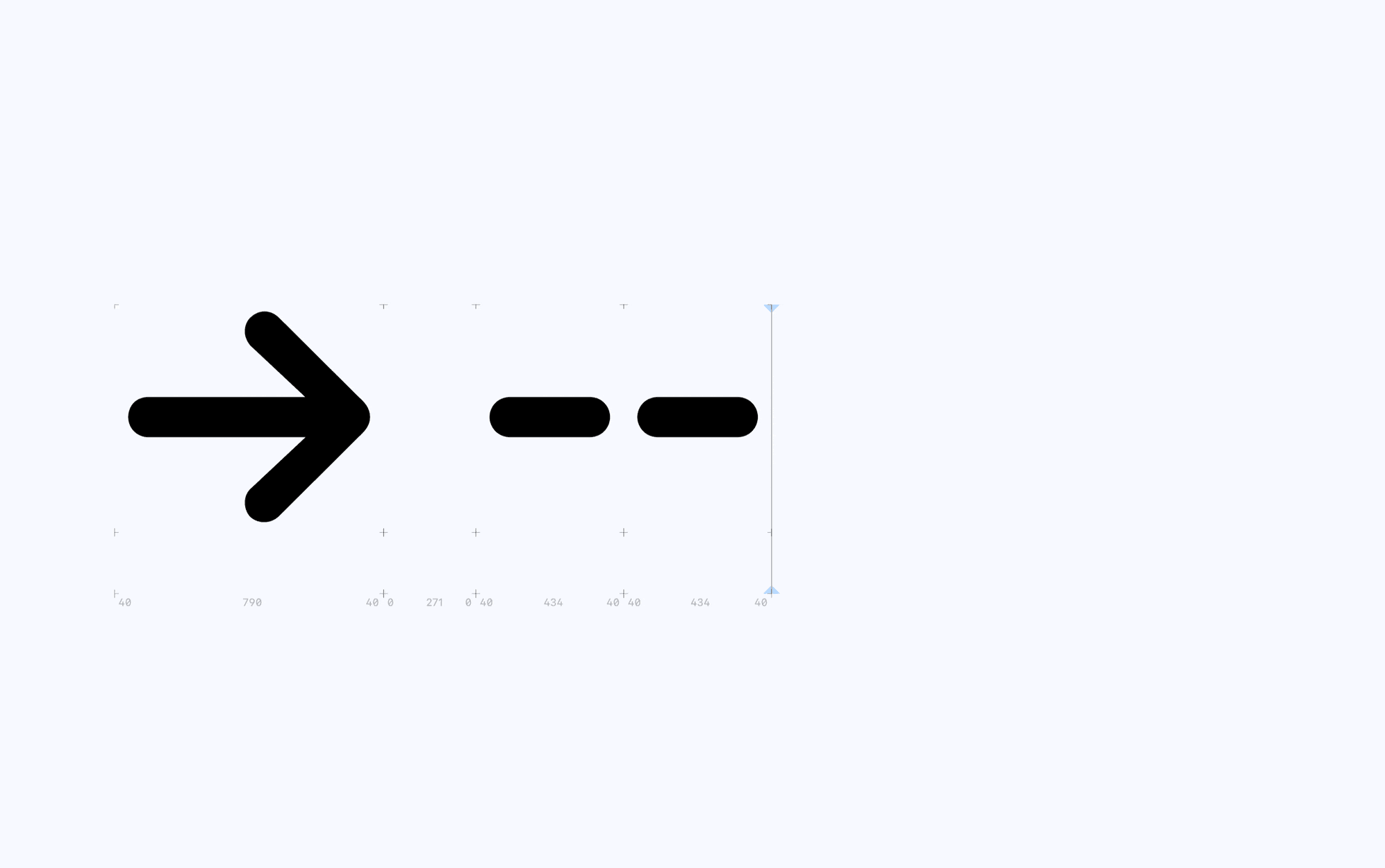
Really happy to hear you like the new typeface! Yes this was a concern of ours as well. We’ve done this intentionally so ligatures work better and are always in line, ala the following example:
However we can modify it so all the arrows and dashes are slightly lower. If anyone else feels the same or you notice anything else that looks out of place let us know – we’ll improve it!
Personally I wouldn’t mind if the solo hyphens where lower and the arrows still centerd just like now. Is there any specific reason that hypens have to be on the same hight as arrows?
For me personally the current hyphen hight is a little distracting while reading. But I’m interessted to hear other peoples opinions too!
It was a design decision so the hyphen wouldn’t jump up when creating arrow ligatures, and we were wondering if our community would notice the increased height of the hyphens and would make a big difference or not. Your feedback has provided some good insight!
Do you have an example gif in which you show that effect? It doesn’t sound too bad to me, compared to the other options ![]() From how I imagine it I wouldn’t mind the jumping hyphen as much.
From how I imagine it I wouldn’t mind the jumping hyphen as much.
Not at the moment, but when we get around to looking into this, I might pop an example on here!
Agreed, hyphens between words look “off” now, and I have way more hyphenated words in my cards than arrows (and I spend more time looking at what’s written than watching what I’m writing as I write it) so I think that between-word typography should take priority.
Another solution would be to use Contextual Alternates to make the hyphen “jump down” when it follows a lowercase letter… although I would vote for a lower hyphen by default which jumps up when it becomes an arrow ligature (and, perhaps, when it is between two uppercase letters, though I personally will likely never have a chance to notice that).
We’ve improved this with the latest release of SN Pro, and this will be added in a minor release to Supernotes before 3.1.