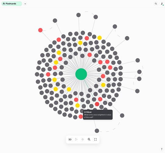
The graph view is actually quite useful, and not just a fun graphic to play with. All of my cards with a color show up in the graph with their color. In the attached image, the yellow nodes are my priority cards for memorization. The red nodes are cards that have problems to solve or review. I can just easily hover the cursor over the nodes (for a popup description bubble), which is much easier and quicker than filtering by color, and then click to view and edit the card. Supernotes should post a view of a graph with this useful feature on its v2 features page.
The animation graphic for the card previews when clicking on a node is just a little on the slow side. But I may just need to restart my computer. I have a couple memory hogging apps open.
As I explore the graph further, I’ll post something in the tips / workflows section.

