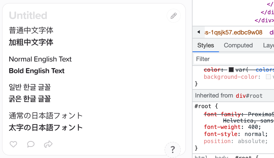
It is really difficult to distinguish between bold and ordinary Chinese character text.

Hi @hahahumble,
Good point, I’ve made a note for us to look into alternative fonts for Chinese text. Hopefully we can get out a fix soon!
2 Likes
It seems that this issue has been resolved on Android, but it still persists on iPadOS and macOS.
Android 13:

iPadOS 17.0:

macOS: 14.0:

All of them are running the latest version of SuperNotes, which is 3.0.4.
Hi @hahahumble, the reason this is fixed in Android but not on Desktop is that it’s using your systems’ default fonts – Android seems to have a better Chinese default font than on iPad / Mac.
The fix for this requires us to load custom fonts for each language which would drastically increase the size of the app, or we will look through the different default fonts and choose a fallback with a better bold text display ![]()
1 Like
It seems that Korean and Japanese also have this problem, possibly because the default Font Weight is set to 500, and when I changed it to 400, it was much better.
2 Likes
May I ask when this issue can be approximately fixed? Or is there any way to make the Font Weight change permanent?
Hi @hahahumble,
This is on our backlog and is grouped with adding improved multi-lingual support to Supernotes as a whole. But I’ve made another note about looking into this again!
1 Like
Is there any update on this issue? My current temporary solution is to open the Developer Tools and modify the CSS each time I open Supernotes.
1 Like
Yes! This bug was fixed a while ago, and then re-introduced when we moved to SN Pro. We just rebalanced SN Pro so that the weights are more consistent, with 400 being the default (instead of 500). This is already live on the iOS / web apps and will arrive in the next monthly update for the desktop apps.
3 Likes