I really like how supernotes offers the ability to aggregate multiple layers of cards together.
However, the current presentation could be improved by providing more visual distinctions between different levels of cards, such as color, grouping, etc., while aggregating.
Effectively this view you’ve shared is the same as using the Outline in the left hand sidebar just split up into columns. The reason we haven’t done this is that it doesn’t scale down well to mobile / narrow-width devices with horizontal scrolling often being more jarring than functional.
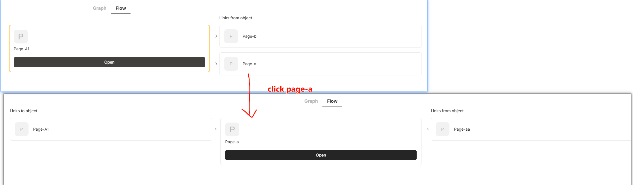
However, I do see your point that having a way to quickly seen the hierarchical journey from grandparent → parent → child cards with related cards would be very helpful. We will see what we can do to improve this. Including backlinked cards within the preview is one of the other improvements worth mentioning, and this could be expanded for other relations.
This model, like broadsheet view, is not helpful on mobile devices,but on large screens, It can do very many things
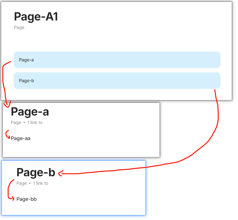
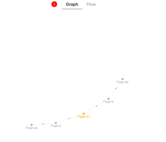
not only does it give the user the ability to aggregate multiple levels of cards, but it also allows for an easy visual representation of the hierarchy of these cards in terms of visualization dimensions.
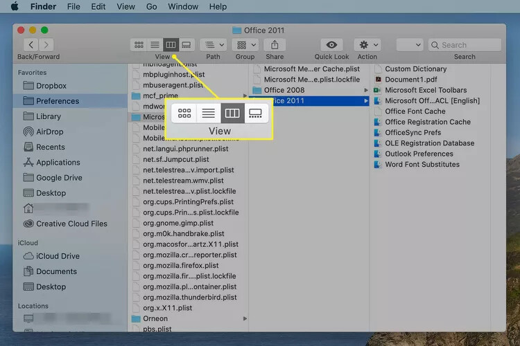
The user’s brain can relax and even quickly move aa cards from a deep card A-a-aa to B-b-bb-(aa). And in the process, it’s as simple as dragging a mac finder with minimal distance and minimal manipulation.
I do see your point that having a way to quickly seen the hierarchical journey from grandparent → parent → child cards with related cards would be very helpful.
That’s really what I’m looking for, how to aggregate multi-layered cards and at the same time visualize their hierarchical relationships. hope there will be more surprises in supernotes