Which three features would you like next?

I know that Supernotes doesn’t have a public roadmap, but I still thought it might be a useful for @tobias and @connor to get a quick snapshot of the community’s current feature priorities.

Please share your top three feature requests, in priority order.

4 Likes

1. Depth

Selectable card depth, per Noteboard, unlocks the full power of Supernotes’ hierarchical taxonomy (just a fancy way of saying the tree structure that the parent-child relationships create). This one feature will improve all the current views, and the export feature.

2. Improved graph view

I never use graph view. The current clustering algorithm doesn’t create a useful view of my 3k+ notes in Home view, the lack of depth selection renders Noteboard graphs useless, the lack of titles makes it difficult to use for exploration/navigation, and the render performance is still far too slow on my M1 MacBook Pro.

3. Tabletop view

List and Broadsheet views are both excellent, and I use them all the time. However, I have a suspicion that Tabletop view (if executed well) could become my favourite view for note creation and connection forming.

7 Likes

Great idea, @JamesT. Here’s my list.

1. Multiple parents filter

My system of organization is somewhat two-dimensional. I would greatly benefit from the possibility to filter the noteboard so that only cards that share a list of specified parents are shown.

2. Batch editing

Currently, once you committed yourself to a system of organization, it is unfeasible to alter it due to the lack of batch editing, the ability to edit meta-data of multiple cards at once. I also mention tag-renaming capabilities here.

3. A true inbox

It is a very common concept for apps to have a dedicated space to drop new input when no further information is given. This may become particulary important once you can share to supernotes using the android/ios share menu. While the thoughts section is intended to serve the identification of to-be-organized notes, for me, a simple inbox would serve that purpose better, as it would allow for handling of new notes using an inbox-zero-strategy, which I failed to apply for the thoughts collection.

8 Likes

Agree with JamesT and freisatz. Just a comment: I mostly use Thoughts for notes I don’t want to appear in the Outline, rather than as a personal inbox. It’s a permanent home for many notes.

1 Like

1. PDF Upload Support
A must-have for my workflow, I try to attach important docs to notes so I don’t have to go find those docs separately.

2. WYSIWYG Editor
Would just simplify the app to see things the same way when you edit and view a note.

3. Mobile App Refinement
This isn’t so much a feature request as a “focus area” suggestion. I rely heavily on the iOS Mobile App for capturing thoughts…just would like to see the app focused on to resolve bugs and get it out of Beta to full Production.

4 Likes

Here are mine.

1. Depth

Same as @JamesT, I would love the capability to view cards under deeper levels, not just the immediate one.

2. Font size settings

The font size in the desktop and mobile apps is too small for me.

3. Better table support

Markdown tables are hit-and-miss. It would be ideal if there’s an option to insert tables in the editor.

2 Likes

I like the way markdown tables are handled by Notable.

Could you expand a bit on this @freisatz? I’m not seeing anything special Notable is doing with tables. Thanks!

As a side note, we have also considered adding a table syntax that would be more list-based (and therefore significantly less verbose than the CommonMark table format), but haven’t made much progress with this yet.

Hi Connor, I’m on the current beta of Notable, and it is likely that what I mean has not found its way to a stable release.

Its plain markdown, no extensions, but editing feels smooth, or at least usable.

That being said, while tables are not very powerful in markdown, I think the opinionated-ness of markdown is one of its core values. To fork away from that would need a very good reasoning.

First of all, Supernotes team is crazy at execution :heart_eyes: :
Design is beautiful, marketing is on point, great transparency, communication and you’re delivering on the product.

It’s rare to see a Startup that give me so much envy to invest and use the product.

My top 3 features are :

1) Table support please

My first feature above all others.
For my personal and pro uses, I sometimes need to create some small tables (to compare competitors website or product by example).
I used Notion and it was great to centralize notes and simple tables but I cannot for now with Supernotes…

However, Notion is not made for short notes, it’s too slow, bulky, just not agile enough for me.
I like sometimes take notes on the fly.

So if you can create a table option, with the Supernotes dna (super-fast, very user friendly) it would be amazing.

I don’t know how can you do this. You can either integrate tables into the notes or maybe having a new type of note that is only tables :thinking: ?

2) WYSIWYG editor
I don’t really get the point of the present formatting system.
Maybe you give us the option to note go faster with typing/shortcut sort of formatting but I prefer to keep this as an option for the power user and just have a WYSIWYG view.

It just more intuitive for the user.

And it saves you some clicks as well, I want to see a note and maybe edit it
Why should I click on it twice to edit it (one for opening it in card reading format and then editting) when you can just click once and read/start to edit it at the same time.

Right now, if I want to edit a card, it takes too much friction sometimes (like 3 to 6 clicks).

Notion has some great shortcut as well, the / button to add anything is very easy to understand, compared to “learn” all the formatting if you’re not use to.
(I know that you’re already using / for other purposes, so maybe you can use another button idk)

Another example is UpNote editor. They have some very great and user-friendly shortcut as well.
You can go anywhere on a sentence, and press command+2 to transform it into H2 title by exemple.

Moreover, it would make image integration and formatting/resizing easier as well, similar to Notion or Upnote.
Sometimes I need to integrate a screenshot in my card, I would it just to take idk 75-50% of the card width not 100%, it just makes the card ugly.

3) Other things not as urgent as the both above
Small customization option, like to give us the choice to keep some card’s child open or not in the tree structure in the left outline menu.

I have some cards that I often need to edit, so it would save a few clicks to make it findable immediately, without going into the tree.

Maybe make the possibility to display the cards larger (it’s just a little bit too narrow for my taste idk, but not a huge deal)

Obviously, keep progressing on the mobile app.

Maybe the possibility to take note with voice and transcript it ? I don’t know if it fits the vision of Supernotes but I never saw a Note app doing this correctly or with a user-friendly voice command formatting. It would be the cherry one the cake.

And please just keep it fast, intuitive and simple.
I don’t know how you’ll balance the complexity to add more features with that, but I trust you will manage it :ok_hand:

1 Like

I want to second everything written above! I really love the app so far and I’m excited to see where Supernotes goes. Here’s my top three:

1. Custom card metadata
Some of my notes are on media like books, games, or music, which would benefit greatly from having custom metadata fields that I could filter on – using tags feels too “coarse” for this, so most of my database-friendly material still lives in Logseq, but I’d love to move it over to Supernotes to better take notes on them.

2. WYSIWYG cards and character count
Already mentioned by others. I’d also like it if the character count was more “WYSIWYG” – for example, if I link a card, it’ll use about 50 more characters than expected because of the UUID for each card, and if I write some LaTeX, each use of “operatorname” (or something similar) adds a lot more characters than one actually sees on the screen. I find Supernotes’ emphasis on small cards very helpful for organizing my thoughts, so it makes me sad when I see “2 cards” in red due to lots of links or LaTeX.

3. Custom card ordering
I’m using Supernotes to both take notes during seminars and plan out my own talks, and in both cases, it would help a lot to be able to drag child cards around into my desired order (i.e. into the chronological order of the talk). Card creation/last edited date doesn’t always correspond to that. I’m working around it by having the parent card include an “outline” with links to each section of the talk, but it’s not ideal.

2 Likes

@joplin6167 To achieve custom card ordering I currently number the card titles, and then sort them alphabetically. It works, but it looks ugly and is extremely annoying when you want to add a card in the middle, so a big +1 from me on your request.

1 Like

@Tobias @Connor I’ve just discovered Cosmograph, and I was extremely impressed with its graph rendering and layout performance. Even on graphs with 10’s of thousands of nodes and edges.

They offer a library to import and use Cosmos (their graph layout and rendering engine) in your own webapp. :sunglasses:

1 Like

Firstly, loving using the app, closest i have ever seen to my “ideal note taking app”

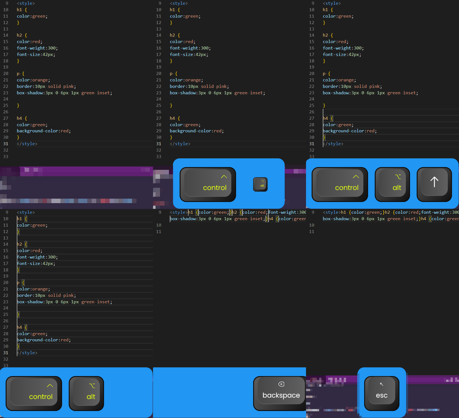
1. an additional multicursor feature.

multiple non-matching lines without clicking
like in vscode, probably the biggest thing from stopping me from adapting supernotes into my dev process.

supernotes1

This is very useful for retroactively making something you spontaneously realize should be a list, into a list.

2. Multiplayer/generally more realtime sync.

Googledocs/codepen/figma jamboard/etc
see other cursors and people,

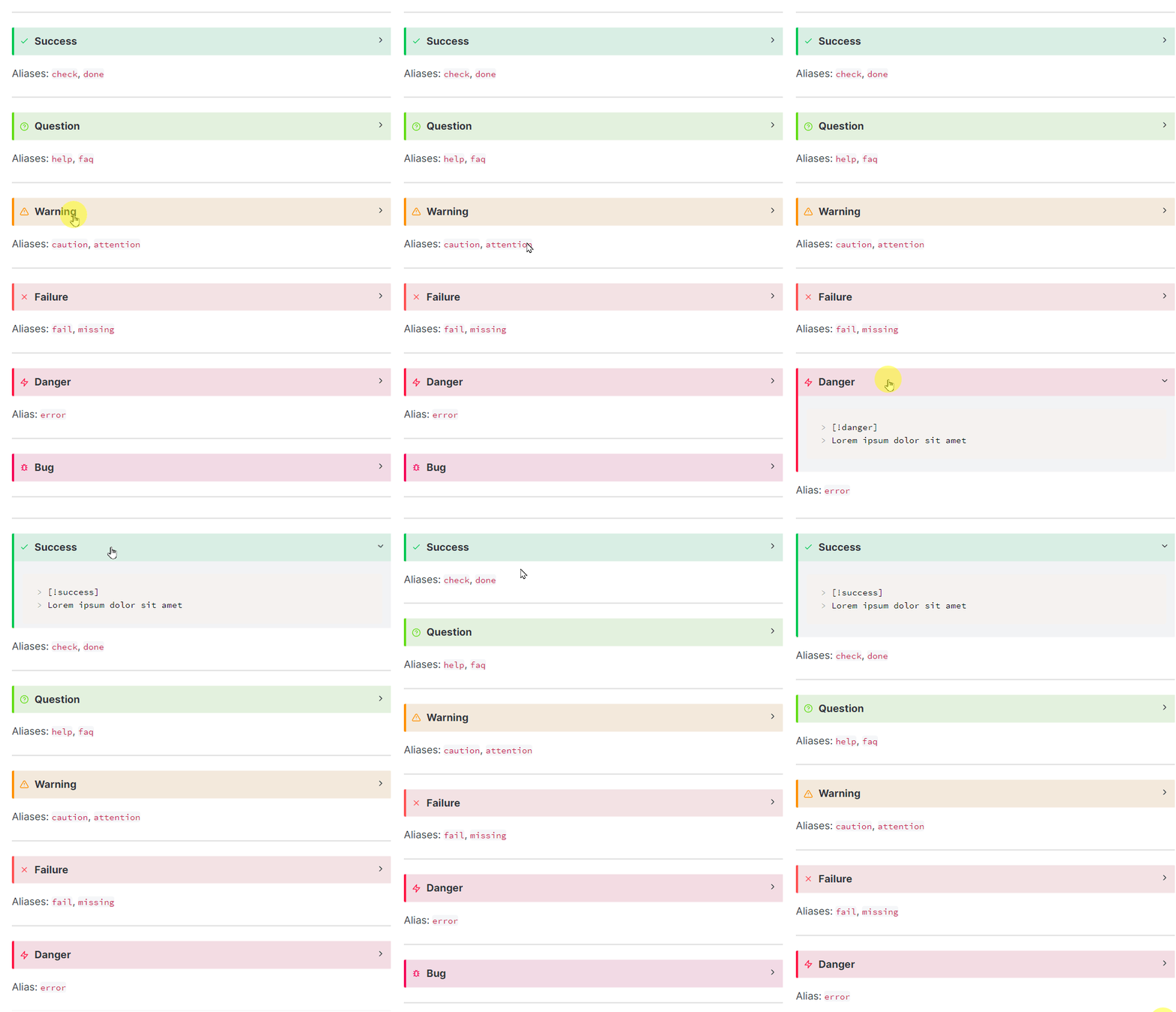
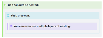
3. Callouts Like in Obsidian. Notices etc.With Folding

supernotes2


This helps my neurodivergent brain parse information.
Header Folding would also work.

Bonus, but I might actually do this one myself, thus why not in the top 3. Integrate with linear. their documents system is lacking. and I feel like the two programs work pretty well side by side.
5 Likes
  1. Offline Mode

Coming from Keep the biggest challenge I have completely moving across is a missing offline mode. I’ve been caught out in offices and around the place not able to access my notes when I needed them because I’ve been in a blackspot. It means I have to hedge my bets using Keep for important notes to make sure I have them when I need them.

  1. Mobile Widget

I’ve found that Supernotes isn’t really suited to quick note taking and a big part of the reason is lack of a mobile widget. As an Android user I’m used to widgets allowing actions with a single click, the Keep widget is a good example of being able to jump straight in, but with SN there’s a pause while it loads, checks online and then brings up the notes. I’d happily accept offline notes with sync for more speed.

  1. Custom Collections

When I look at my home view there are notes everywhere and a lot of those have been allocated to a parent. I don’t know how other people use their notes but the way that I see attaching a note to a parent is akin to placing it in a filing cabinet, what’s left on the home view is anything I haven’t sorted out or I’m working on. Right now there isn’t really a good way to sort those out so it would be good if there was some way to enact that

3 Likes

CAPTURE!!! - via extension, share sheet or widget. Lack of capture is the biggest gap imo

Full integration of slash commands for md items like date, time, etc

WYSIWYG

5 Likes

I read in another post that collections are coming soon, so that is exciting.
Offline mode is in the works as well, which is an interesting feature to have.

The one thing I’m waiting for and not seeing a lot of activity on is being able to export your notes in a future-proof way. There is some discussion on this here → Add metadata to the exported markdown files - #10 by ncolestock , but I’m not sure it’s on the roadmap somewhere.

PS: I have to say version 2.2 has come a long way since I last used Supernotes and is very enjoyable to use.

Edit: Oh yeah, batch editing and renaming tags would be very good to have as well :wink:

2 Likes

Here’s some things I would like to see

  • OCR Search over images and PDFs
  • Flashcards with notes, so converting cards to flashcards or one card to multiple flash cards
  • Offline mode
  • Runnable code snippets
  • Kindle Imports (without having to have a Readwise subscription)
  • Supernotes Clipper extension & app, to save from phone/tablet or browser

Also would like to see more adoption of this and reviews on YouTube as I don’t want the product to not gain traction.

1 Like

I’ve only been here a day but wanted to say that the calendar is what hooked me. I love the heatmap and would love the ability to filter which cards are represented in the calendar. Would help me a lot when consolidating notes for my monthly reports.

1 Like